This post is the second part of my previous post (Track your life with Tasker and Keen.io - Part 1) on using keen.io for personal life event tracking
In part 1 I have quickly explained how I use keen.io simple REST API to track and store events in the keen.io's cloud.
I have also created an Android application using Tasker and I made everything available on git hub for everyone to use and contribute.
In this post I am now focusing in visualizing the information collected and stored in the cloud.
I should admit that once again, keen.io is doing most of the job for me. Yet another reason for me to considering it a great service.
Datahero.com
One very simple way to visualize keen.io events information is to use another cool service from the team at https://datahero.com/
On their website is written that Datahero "Create rich analyses and share your insights in seconds."
I used for something like 15 minutes and I can only agree with that statement.
I have created a trial account and in matter of minutes I was proficient in visualizing my analytical data from keen.io
You just need to:
- connect keen.io to datahero
- import your preferred keen.io colletion
- create some charts using a cool visual editor
- add your chart to a dashboard
There are way too many option for me to explain in this post but from what I have seen it is a very interesting service.
Below the simple dahsboard I have created by connecting keen.io and datahero. It took me no more that 12 minutes!!! :)
Keen.io dashboards
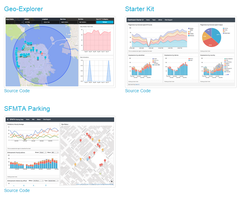
Al alternative way (there are many more ways) for lazy :) people like me is to use the great tools provided by keen.io at this link https://github.com/keen/dashboards
Even if you are not a developer you can easily build your own personalized dashboard in minutes with the tools provided.
Start by cloning the git with the following command (on Linux. On Windows can be different)
This will provide you with plenty of dahsboard layouts ready to use
and some interesting example to learn from (what else one can ask for? :) )
I am here using the two and one layout which I like it
you can find it in the following directory <YOUR DIRECTORY>/dashboards/layouts/two-and-one assuming that YOUR DIRECTORY is where you have executed the git clone command
Have a look at index.html. This is the file to modify to populate your dashboard with beautiful charts
The structure is very simple. Every chart area of the layout is a set of 3 self-explanatory DIV
Set the proper title for your chart (<div class="chart-title">) and add a relevant note (<div class="chart-notes">)
In order to add the chart you need to modify the <div class="chart-stage"> in the following way:
- delete the <img data-src="holder.js/100%x350/white"> line. This is just a placeholder
- add an id to the chart-stage div like this: <div class="chart-stage" id="chart1">
The id will be useful later and will be used by the keen.io data visualization API
keen.io query designer
Now we have our layout ready to display our chart which is taking the data out of the keen.io collection.What is missing is a small chunk of Javascript which build the proper query and instruct the kee.io client to display the chart.
Don't worry this is unbelievable easy: just go to https://keen.io/project/<YOUR PROJECT ID>/workbench
You will access your keen.io Workbench. This is a very easy to use tool to generate the necessary JS code for your dashboard
Select the mandatory collection you want to query and the analysis type (sum, average, ....).
In addition you might specify optional parameters like filters, timeframe, ....
You can read all the detail about Data Analysis API here
When you have properly set up your query just hit the Run Query button and you will be immediately see a chart representing your query.
In order to see the Javascript code which generates the chart click on the Javascript tab. You should see something similar to this
That's it!! :)
Just cut&past this chunk of JS into your index.html, wrap it into a <script></script> block and you will see the chart appearing in your own dashboard.
You should replace the projectId and the readKey with your values that you can find in your keen.io project page.
Also very important is to change this line client.draw(query, document.getElementById("my_chart") in client.draw(query, document.getElementById("chart1")
This line is telling keen.io visualization client to run the query called query and to display the resulting chart in the div with id chart1
Save your file and refresh your web browser and bam!!! Your own dashboard is up and running
Here a simple one I have created out of the data collected with my Track Me application
These layouts are fully responsive and display perfectly also on my android phone
The charts are fully customizable and have many options to set.
You can find detailed information here Google Charts
In this two part series of post I have shown you how it is easy to collect, store, analyze and visualize your valuable information. The trick is to use smart and easy to use tools like keen.io and others.
If you like this idea let me know. If you don't like it let me know
Feel free to contribute.
Happy analytics!!! :)


Nessun commento:
Posta un commento